Quilled creations that amaze – Yulia Brodskaya
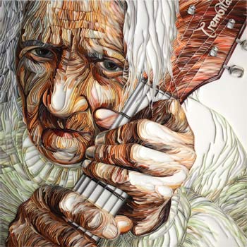
Outstanding quilling patterns and designs
Yulia Brodskaya is mostly known for her amazing quilled creations. Amazing is a huge understatement as she adds a new dimension to the art of quilling with work that literally makes your jaw drop.
I first came across her talent when looking for ideas for a quilling project. While seeking out new ideas on Google an image of an old man with a guitar leapt off the page. It was in a class of it’s own. I tracked down Yulia’s web site and spent a long time admiring what I saw.
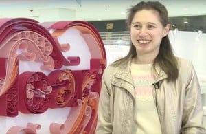 When Yulia started quilling she didn’t know that this form of art existed. she admits to having not a a clue about traditional basic quilling shapes or craft tools and techniques in those early days. It was only later when her artwork began to get noticed by art bloggers that she realised it was a specific art technique.
She had invented her own form of quilling from scratch without any mainstream influences which is evident in her free and unique designs.
“Paper always held a special fascination for me. I’ve tried many different methods and techniques of working with it, until I found the way that has turned out to be ‘the one’ for me: now I draw with paper instead of on it”.
Yulia shapes her artistic lines using heavy paper and card and was the first to combine quilling with typography. The very first of her quilled creations was her name ‘Yulia’.
Her use of paper for creating line is fascinating and the color combinations are truly remarkable.
The beauty of quilled artwork at this level is the 3D effect produced. The artwork has depth and breadth and changes from every angle that you look at it.
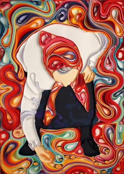
In this piece ‘Coins’ Yulia makes great use of block background color to emphasise the subject matter.
The swirling oranges, blues and greens around the central figure give it a sense of movement and you can almost feel the old woman bending to pick up the coin. This superb use of paper is a feature that appears in all Yulia’s quilling images and really serves her well.
The following example ‘Loves Doves’ shows exactly what paper can do to bring out the character, action and amazing texture of an old man surrounded by doves. The way in which Yulia has placed and shaped the paper gives the whole image a wonderful feathery and slightly claustrophobic feel. The poor man may ‘love doves’ but here he is totally overcome by his feathered friends!
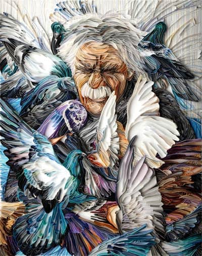
This is one of my favourite compositions as it is action packed, vibrant and really captures the moment. The balance of line draws you straight to the mans screwed up expression – brilliant!
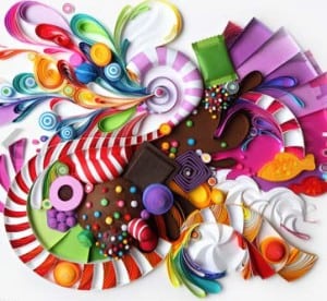 Yulia’s quilled creations are making their mark
Her obvious talent has not gone unnoticed and Yulia is often asked to speak at conferences and schools for design globally. Her quilling images are highly sought after with the likes of Oprah Winfrey and The San francisco Museum of Art owning her artwork. There are over 10 books that feature her work. A testement to a truly innovative artists work.
I caught up with Yulia recently and managed to ask a few questions about her work:
Do your ideas come mainly for clients or your own imagination and do you have a way of coming up with ideas?
For commercial projects I have to search for inspiration within the set boundaries of the brief and since every idea has to be approved by an agency/client it is always a collaborative process. I get some rest from this need to temper my own imagination and preferences by working on personal works (mainly portraits).
In most cases I need some visual reference to trigger an idea and imagination; so I constantly look through various photographs/artworks/designs and keep an archive of all the images that caught my eye for one reason or another. When stuck and looking for inspiration I go back to my visual library (or search online if that’s something completely new that I’m researching) and it works every single time.
When you have a new commission what is the process for planning out the design – do you do rough outlines first or do you get straight into it?
I always make sketches first; they can be more detailed or less detailed depending on the particular image/look that I have in mind.
The following youtube video suggested by Yulia shows her in action mapping out the design and then adding the quilled elements.
They are not so delicate actually. A single strip would be delicate, but many of them together make quite a strong raised surface – the key is to place a firm board on top of the work for transportation so that the pressure is distributed equilly.
For me it is still all about paper; I have tones of ideas for personal artworks that I want to bring into life; they take lots of time to make so I have plenty for quite a while.
The following Youtube video created by the Hong Kong Tatler is a short but very interesting insight into Yulia Brodaskaya’s quilling artwork.
If you would like to see more of Yulia Brodskayas unique quilling artwork and projects visit her website artyulia.com here…
 Related quilling posts
- How to make basic quilling shapes – fully illustrated tutorial [more…]
- 5 top rated quilling kits for beginners [more…]
- Review: Quilling books [more…]

